


When a business name is it’s family name their identity needs to work that bit harder to visually communicate what they do.
As experts in the cultivation of root vegetables we used this as the foundation of their new identity.

The visual language incorporated their core product offering of carrots, beets and parsnips, striking a balance between the traditional and the contemporary.
The tagline ‘Where great produce takes root’ verbally supported this visual message.
In developing the identity we neeeded to ensure it translated across different applications and touchpoints achieving a consistent and cohesive brand mark regardless of the end usage.
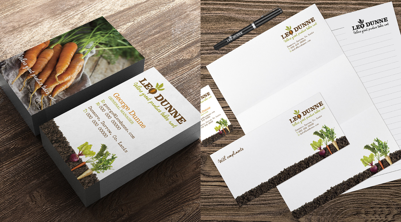
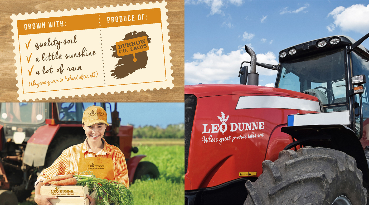
The style of photography was carefully chosen to infer a tone of voice that was authentic with the produce raw, pure and straight from the soil just as nature intended.

In designing their carrot packaging range we wanted the actual product to integrate with the graphics where the space between the slats of the wooden crates is the clear window on the front of pack.
To achieve a reduction in print costs, the design system was cleverly developed so that when they wanted to switch between Organic and Non-Organic variants it meant a change in just two printing plates.


